If you, like me, spend most of your time in the Labelsadmin interface, building Blippa systems, you might need an updated work environment…
Why not change the look-and-feel with some CSS magic?
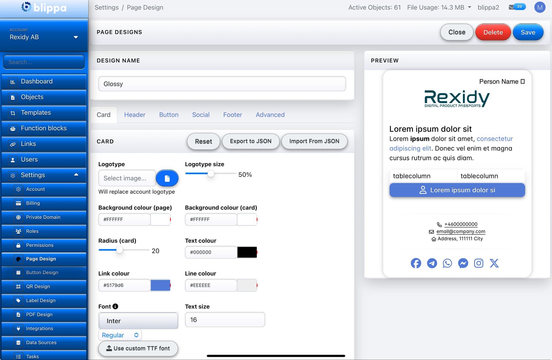
Like this?
Somt time ago, our developers added the possibility to change the apperance of Labelsadmin by adding CSS code in SETTINGS- MISCELLANEOUS- CUSTOM CSS FOR LABELADMIN
Great, If you know how to code CSS!
But, if you like me cannot code? And are too lazy to learn?
Well, I started off with a CSS made by our developer and asked ChatGTP to ”Convert this CSS using Apple Glossy CSS”
(Note: You can probably use the generated CSS below and tell ChatGTP to convert it to another Apple era (Aqua 2006, iOS 6 gloss, macOS Big Sur translucent) )
Here is the CSS to paste into Labelsadmin:
/* -------------------------------------------------
Apple Glossy Theme for Labelsadmin
By Mikael Runhem, Rexidy AB/Blippa.comVersion 2025-11-18
------------------------------------------------- */
/* System-style Apple fonts (no external @importimportimportimport needed) */
body.admin {
font-family: -apple-system, BlinkMacSystemFont, “SF Pro Text”,
“Helvetica Neue”, Arial, sans-serif !important;
font-size: 16px !important;
-webkit-font-smoothing: antialiased;
background: #f2f3f7;
color: #111;
}
/* Core theme variables (tweak these if you like) /
:root {
/ Main aqua/blue primary color (Apple-ish) */
–la-primary: #007aff;
–la-primary-dark: #0051a8;
–la-primary-deep: #004080;
/* Accent + neutrals */
–la-accent: #34c759;
–la-border-soft: rgba(0, 0, 0, 0.08);
–la-border-strong: rgba(0, 0, 0, 0.18);
–la-surface: #f9fafc;
/* Gloss & depth */
–la-gloss-highlight: rgba(255, 255, 255, 0.60);
–la-gloss-highlight-soft: rgba(255, 255, 255, 0.35);
–la-gloss-shadow: rgba(0, 0, 0, 0.35);
–la-inset-shadow: rgba(0, 0, 0, 0.18);
/* Radius + blur */
–la-radius-lg: 12px;
–la-radius-md: 8px;
–la-radius-sm: 5px;
}
/* -------------------------------------------------
SIDEBAR – glossy panel
(Labelsadmin uses #sidebar, .bg-dark etc.)
------------------------------------------------- */
#sidebar,
.bg-dark {
background: linear-gradient(
to bottom,
var(–la-gloss-highlight) 0%,
var(–la-primary) 12%,
var(–la-primary-dark) 45%,
var(–la-primary-deep) 100%
) !important;
border-right: 1px solid rgba(255, 255, 255, 0.25);
box-shadow:
inset 0 1px 0 rgba(255, 255, 255, 0.4),
inset 0 -1px 0 rgba(0, 0, 0, 0.3),
0 0 0 1px rgba(0, 0, 0, 0.35),
0 12px 25px rgba(0, 0, 0, 0.45);
}
/* Sidebar links – glossy hover highlight */
#sidebar a,
#sidebar .nav-link {
color: #fdfefe !important;
text-shadow: 0 1px 1px rgba(0, 0, 0, 0.7);
}
#sidebar a:hover,
#sidebar .nav-link:hover,
#sidebar .nav-link.active {
background: radial-gradient(circle at top center,
rgba(255, 255, 255, 0.35),
transparent 60%) !important;
box-shadow:
inset 0 1px 1px rgba(255, 255, 255, 0.6),
inset 0 -1px 2px rgba(0, 0, 0, 0.5);
border-radius: var(–la-radius-sm);
}
/* Optional: compress sidebar sections a bit */
#sidebar .nav-item {
margin-bottom: 2px;
}
/* -------------------------------------------------
TOP NAVBAR – subtle glassy bar
(covers common Bootstrap nav classes)
------------------------------------------------- */
.navbar,
.navbar-dark,
.navbar.bg-dark {
background: linear-gradient(
to bottom,
rgba(255, 255, 255, 0.75) 0%,
rgba(255, 255, 255, 0.45) 35%,
rgba(255, 255, 255, 0.15) 100%
) !important;
backdrop-filter: blur(16px);
border-bottom: 1px solid rgba(0, 0, 0, 0.18);
box-shadow:
0 1px 0 rgba(255, 255, 255, 0.6),
0 5px 16px rgba(0, 0, 0, 0.25);
}
/* Navbar brand + links with subtle shadow */
.navbar .navbar-brand,
.navbar .nav-link {
color: #111 !important;
text-shadow: 0 1px 0 rgba(255, 255, 255, 0.75);
}
.navbar .nav-link:hover,
.navbar .nav-link:focus,
.navbar .nav-link.active {
color: var(–la-primary-dark) !important;
}
/* -------------------------------------------------
CARDS / PANELS / MAIN CONTENT
------------------------------------------------- */
.card,
.panel,
.panel-default,
.well,
.box {
background: linear-gradient(
to bottom,
rgba(255, 255, 255, 0.95) 0%,
rgba(255, 255, 255, 0.90) 40%,
rgba(245, 246, 250, 0.95) 100%
);
border-radius: var(–la-radius-lg);
border: 1px solid var(–la-border-soft);
box-shadow:
0 1px 0 rgba(255, 255, 255, 0.8),
0 15px 30px rgba(0, 0, 0, 0.18);
}
/* Panel/card headers – Apple-ish chrome */
.card-header,
.panel-heading,
.box-header {
background: linear-gradient(
to bottom,
rgba(255, 255, 255, 0.95) 0%,
rgba(230, 233, 240, 0.98) 100%
);
border-bottom: 1px solid var(–la-border-strong);
border-radius: var(–la-radius-lg) var(–la-radius-lg) 0 0;
font-weight: 600;
letter-spacing: 0.01em;
}
/* -------------------------------------------------
BUTTONS – big glossy Aqua style
------------------------------------------------- */
.btn,
button,
input[type=“button”],
input[type=“submit”] {
border-radius: 999px !important;
border: 1px solid rgba(0, 0, 0, 0.35);
padding: 0.5rem 1.2rem;
font-weight: 500;
letter-spacing: 0.01em;
box-shadow:
inset 0 1px 0 rgba(255, 255, 255, 0.9),
0 3px 7px rgba(0, 0, 0, 0.4);
text-shadow: 0 -1px 0 rgba(0, 0, 0, 0.45);
}
.btn-primary,
.btn-success,
.btn-info {
background: linear-gradient(
to bottom,
#4dc2ff 0%,
var(–la-primary) 40%,
var(–la-primary-dark) 100%
) !important;
color: #fff !important;
}
.btn-secondary,
.btn-default,
.btn-outline-secondary {
background: linear-gradient(
to bottom,
#ffffff 0%,
#eaedf3 50%,
#d0d5e0 100%
) !important;
color: #222 !important;
text-shadow: 0 1px 0 rgba(255, 255, 255, 0.85);
}
.btn-danger {
background: linear-gradient(
to bottom,
#ff6b6b 0%,
#ff3b30 40%,
#c1271d 100%
) !important;
color: #fff !important;
}
/* Pressed state */
.btn:active,
button:active,
input[type=“submit”]:active {
transform: translateY(1px);
box-shadow:
inset 0 2px 3px rgba(0, 0, 0, 0.4),
0 1px 2px rgba(255, 255, 255, 0.6);
filter: brightness(0.97);
}
/* -------------------------------------------------
FORMS – soft, slightly inset fields
------------------------------------------------- */
input[type=“text”],
input[type=“email”],
input[type=“password”],
input[type=“number”],
select,
textarea,
.form-control {
border-radius: var(–la-radius-md) !important;
border: 1px solid rgba(0, 0, 0, 0.18);
background: linear-gradient(
to bottom,
#ffffff 0%,
#f6f7fb 100%
);
box-shadow:
inset 0 1px 3px rgba(0, 0, 0, 0.12),
0 1px 0 rgba(255, 255, 255, 0.7);
}
/* Focus ring – iOS-style blue glow */
input:focus,
select:focus,
textarea:focus,
.form-control:focus {
outline: none !important;
border-color: var(–la-primary);
box-shadow:
0 0 0 2px rgba(0, 122, 255, 0.35),
inset 0 0 0 1px rgba(255, 255, 255, 0.75);
}
/* -------------------------------------------------
TABLES – crisp header, soft rows
------------------------------------------------- */
table,
.table {
border-radius: var(–la-radius-md);
overflow: hidden;
background-color: #ffffff;
box-shadow:
0 1px 0 rgba(255, 255, 255, 0.9),
0 10px 20px rgba(0, 0, 0, 0.12);
}
thead,
.table thead th {
background: linear-gradient(
to bottom,
#fdfdfd 0%,
#e6eaf3 100%
);
border-bottom: 1px solid var(–la-border-strong);
font-weight: 600;
}
tbody tr:nth-child(even) {
background-color: #f7f9fc;
}
tbody tr:hover {
background: linear-gradient(
to right,
rgba(0, 122, 255, 0.05),
transparent 70%
);
}
/* -------------------------------------------------
BADGES / LABELS / PILLS
------------------------------------------------- */
.badge,
.label,
.badge-primary {
border-radius: 999px;
padding: 0.25rem 0.6rem;
background: linear-gradient(
to bottom,
#4dc2ff 0%,
var(–la-primary) 100%
);
color: #fff;
text-shadow: 0 -1px 0 rgba(0, 0, 0, 0.4);
}
/* -------------------------------------------------
PAGINATION
------------------------------------------------- */
.pagination .page-link,
.page-item .page-link {
border-radius: 999px !important;
border: 1px solid rgba(0, 0, 0, 0.2);
background: linear-gradient(
to bottom,
#ffffff 0%,
#e6eaf3 100%
);
box-shadow:
inset 0 1px 0 rgba(255, 255, 255, 0.9),
0 2px 4px rgba(0, 0, 0, 0.25);
}
.pagination .active .page-link {
background: linear-gradient(
to bottom,
#4dc2ff 0%,
var(–la-primary) 100%
);
color: #fff;
}
/* -------------------------------------------------
SMALL DETAILS
------------------------------------------------- */
hr {
border: 0;
height: 1px;
background: linear-gradient(
to right,
transparent,
rgba(0, 0, 0, 0.25),
transparent
);
}
.tooltip-inner,
.popover {
border-radius: var(–la-radius-md);
}