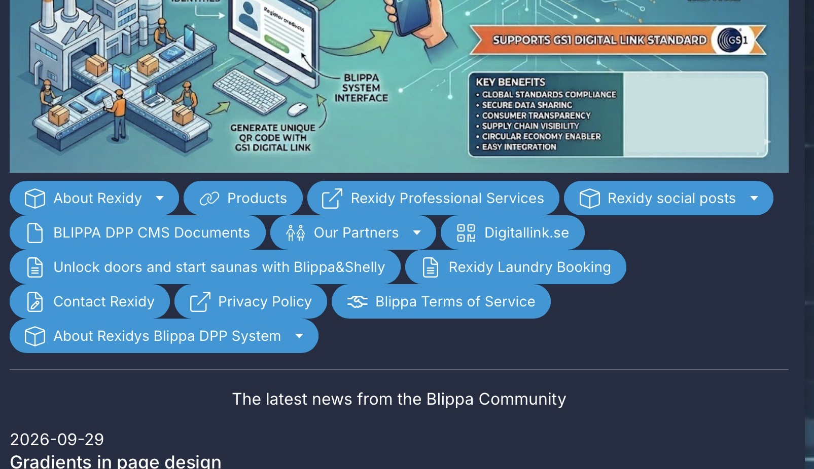
I asked Claude to take a look at https://rexidy.com and make a CSS where the buttons are in a line.
Not sure if it is an improvement. Perhaps having different CSS for mobile and desktop, since the traditional button placement in Blippa is more usable on a mobile.
See below for the CSS.
/* Smaller buttons */
button,
.btn, .button,
a.btn, a.button,
[role=“button”],
input[type=“button”],
input[type=“submit”] {
width: auto !important;
min-width: 0 !important;
display: inline-flex !important;
align-items: center;
justify-content: center;
padding: 6px 14px !important;
font-size: 14px !important;
line-height: 1.2 !important;
border-radius: 6px;
margin: 0 !important;
white-space: nowrap;
}
/* Put buttons side by side, wrapping to new rows */
:is(div, nav, section, ul, p):has(> :is(button, .btn, .button, a.btn, a.button, [role=“button”])) {
display: flex !important;
flex-direction: row !important;
flex-wrap: wrap !important;
justify-content: center;
gap: 8px;
}
/* Keep each button its natural width */
:is(div, nav, section, ul, p) > :is(button, .btn, .button, a.btn, a.button, [role=“button”]) {
flex: 0 1 auto !important;
}
/* Slightly larger tap targets on phones */
@media (max-width: 480px) {
button, .btn, .button, [role=“button”] {
padding: 8px 12px !important;

font-size: 13px !important;
}
}